Why physical buttons are crucial to calm technology-based lighting systems
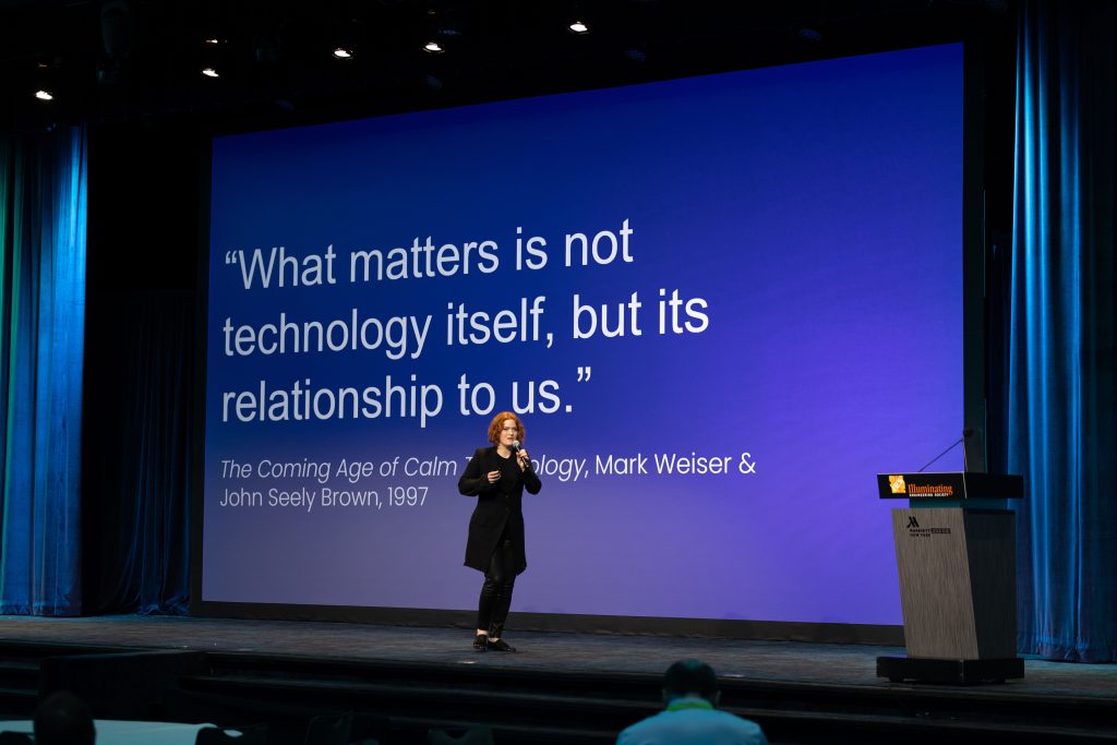
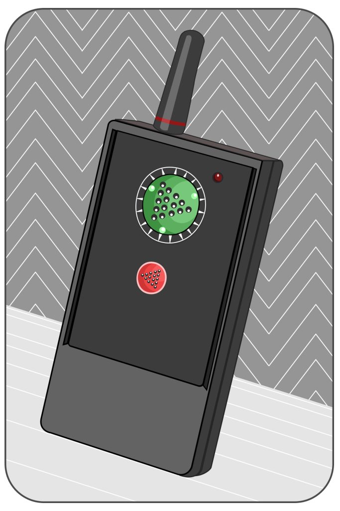
I gave the keynote address at IES2024: The Lighting Conference in August. My talk was about Calm Technology, a framework about making technology that uses the least amount of attention and only when necessary. There are many applications to designing lighting systems. While changing my slides during the presentation, I was even able to appreciate another, under-valued design feature that made my talk so much easier: The presentation remote had three little raised dots on its buttons. I didn’t have to look down at it once through the rest of my keynote, and could instead focus completely on what I was communicating.
After giving over 500 speeches, running an underground music venue and its lighting system, running a photography studio, and growing up alongside automation systems hand-built by my inventor dad, I’ve come to highly value elements like those small, raised dots.
The difference between the materials that lasted in our home, in the music venue, and in the photography studio—regardless of whether they were physical or digital—became clear to me over time: tactility and ease. Or to put it in terms of a design principle: It’s important to be able to use a tool while you’re doing something else. The three little dots on my slide remote gave me a sense of peripheral attention and control. I could understand what I was doing, and I could focus on my task—engaging with the audience—without having to glance down at my control.
Designers of video-game controllers had to learn this principle early on. The point of gameplay is to be immersed in a game world, over a long period of time. Since game devices had to be designed to support full screen focus, almost all of them have tactile support—raised symbols and other physical features built into the individual buttons. Having to look at the controller while playing a video game takes you out of the game. Even a split-second distraction like that can end up causing you to lose. Outside video-game consoles, however, we deal with countless devices that often take us out of the game of life.
In the rush to flatten everything, whether for reasons of affordability to manufacture, the aesthetic of sleekness, or just the dominance of smartphone-like touchscreens, where physical buttons are nearly non-existent in the everyday experience, we’ve lost an important sensory aspect to our appliances. Unlike video-game controls, there’s rarely any haptic feedback to tell you that you’ve successfully pressed a button. Which, again, means you have to take attention away from your local environment to study the interface.
Where Touchscreens Have Taken Us
While physical controls continue to be digitized, people still need to be able to perform their task at hand and immediately understand what a control does—at a glance, and then through tactile reference, without having to stop what they’re doing—or worse, have to shine their smartphone’s flashlight on the controller to identify which function does what.
I suspect the lighting design community is feeling pressure to completely digitize their interfaces. Before my IES keynote, I had some time to stroll around the conference’s trade-show booths. There were so many great products and amazing people. While many of these lighting devices were impressive, I gradually noticed something was conspicuously missing: Very few of these appliances had ease or tactility.
At one booth, I received a hands-on demo of a new DMX control system. Like many apps, the controls had been digitized into something similar to an iPad. Also like most apps, the controls on the touchscreen completely resembled those of the original analog controls—a bit of a mixer board with up and down slides.
The problem is that making a digital system look like an analog one doesn’t make it feel like an analog system. While the app looked like a mixer board, it couldn’t be used like a mixer board. When you lose tactility, you have to make up for it in ease of use. I found myself touching one of the controls, but it didn’t move. I eventually realized I had to focus on the device and really put my finger precisely onto the touch target before it moved. In other words, I could only control the device if I focused all of my attention on it. Furthermore, the satisfaction of pressing any of the buttons was lost. This made the whole interaction feel like the experience of rubbing on sandpaper when you’re expecting a smooth finish.
Frustrated, I told one of the people at the booth: “You could fix this by making the touch target size 125% of the size of the indicator. That way, you don’t need to click precisely on the controller, but it will still move, and you can start to kind of memorize where the controls are on the pad.” With enough spacing between the sliders, you can still click on something and not click the wrong slider—but you also don’t need to be so precise when you click a slider. This creates a feeling of ease that’s similar to a tactile sense. It’s not perfect. It’s not going to replace the true joy of memorizing where all of the sliders are, but it does partially make up for what’s been lost by the rush to digital interfaces.
The need for tactility isn’t just about the cognitive switching cost of having to put your thought process on pause or stop conversational flow with the person you’re working with—it’s that without it, there is a sense that the device you’re using isn’t truly designed with your use in mind.
What Lighting Loses Without Physical Buttons
The loss of tactility is a huge issue with new light switches that don’t “feel” like anything. I’ve seen people repeating their light adjusting behaviors or even smacking the wall because the switch on the touchscreen has given no feedback that it’s done anything.
These phenomena frequently happen when travelers visit a place with lots of new, energy-efficient gear recently installed. End users stumble about, half-awake in the middle of the night, trying to find and activate a small hall light to reach the kitchen for a glass of water. The simple act of touching the control panel and trying to find the right icon probably wakes them up fully, ruining their sleep. When a device is difficult for consumers to use, two things happen: Their time is wasted, and their joy at experiencing everyday life gets diluted just a little bit. With enough negative experiences like this, they get a net negative effect. Little daily activities that used to be pass-through events become the focus in themselves. We should always be focusing on the task, not the tool. The more we focus on tools, the less we live our lives.
Design Takeaways for Tactility
You’ve probably experienced a lack of appliance tactility in your personal life, from kitchen stoves with no buttons to weird, “advanced” light switches. You might get irritated in the moment, but then dismiss that feeling because “This is just the way things are going.” I disagree. There are ways to make things better, and all of us in industrial design have an opportunity to rally behind tactility and ease—and in doing so, advocate for our customers’ ease and enjoyment. Not just designing how something looks, but in how it feels, and if we can use it with peripheral attention while we’re doing something else.
With that in mind, here are several Calm Tech principles to consider when designing light interfaces:
- Primary actions can be done with partial attention, without requiring full attention. For instance, you shouldn’t need to look at the product to be able to turn it on or off.
- Action buttons should protrude or be recessed. Primary action buttons should protrude or be recessed compared to the surface around it, providing a physical distinction that users can feel. As with my slide projector example, this enables us to interact with the interface even in the dark.
- The majority of interactions should be represented by clear iconography: All icons should follow an existing vernacular. Use clear icons well-known in the product vocabulary; don’t try to invent new ones.
- Tactile feedback for buttons: Button tactile feedback should have 100 to 200 grams of haptic actuation (or simulated actuation through tactile feedback) force for keyboards or 200 to 300 grams of actuation force with clear tactile point for physical buttons like on/off switches to ensure non-accidental presses. In conclusion, bring back some tactility! It will help make things easier to use, and more enjoyable, at a quick touch.

Further Reading
I think about tactility a lot, and so do some other neat humans. “Tactile Controls In A Digital World” by Scott Jenson is fantastic and can be found here: https://jenson.org/airpod/. Additionally, some time ago, I wrote at length about touchscreens in cars and why that’s a bit of an issue. Find “The Hidden Cost of Touchscreens” here: https://caseorganic.medium.com/whydo-we-keep-building-cars-with-touchscreens-alt-the-hiddenlives-of-touchscreens-55faf92799bf
THE AUTHOR |
Amber Case is the founder of the Calm Tech Institute, which provides a set of checklists for digital and physical product makers who wish to make their stuff more pleasant to use.


