By Paul Tarricone
Hospitality influences eliminate signage and usher in a new paradigm at a Chicago-area library
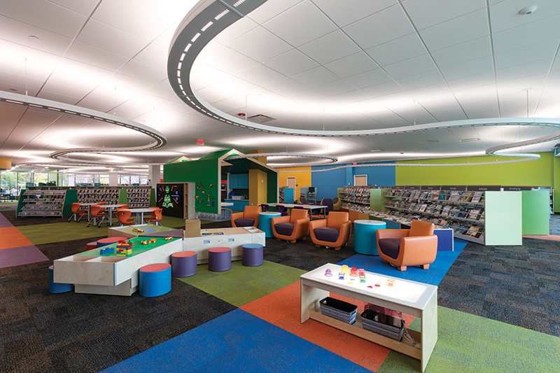
This way to the kids section. Upstairs to the adult reading room. Head left to the media center. Signage, arrows, words—standard operating procedure in a library. The mission for Product Architecture + Design, Chicago, at the Indian Trails Public Library in Wheeling, IL, was to turn that model on its head. The firm’s strategy was to use architectural elements—not signage—as a wayfinding device, all in pursuit of a design that gives off a hospitality aura, not an institutional one.
The design started with a vacation. “We initially began with a clean wood look, but halfway through the design, the library director had come back from a hotel vacation and said ‘I want that,’ ” recalls Dan Pohrte, principal of Product Architecture + Design, which collaborated with KSA Lighting & Controls on the lighting plan. “He wanted a lounge feel, like you’re in a hotel,” adds Tiffany Nash, Product Architecture + Design principal.
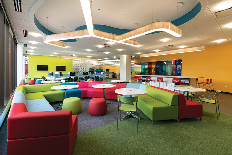
Pohrte adds that the hospitality mandate was not a surprise. “Libraries, in general, are going that way.” For this $14.4 million, 15,000-sq ft addition to the 45,000-sq ft existing library, the architects drew on influences from the hospitality industry to create an atmosphere that feels warm and welcoming, rather than institutional. A careful architectural balance is achieved with a juxtaposition of textures and finishes; heavy stone façades offset warm wood ceiling panels, while glass room dividers bring a lightness to the space.
And most significantly, one tried-and-true institutional staple was abolished: signage. Instead of signs, the architecture itself guides patrons through the library. Elements including color bursts and distinctive curvatures in the carpets, ceiling panels and light fixtures draw definition between zones in the library. “We used lighting as a tool to pull people intuitively throughout the library. In this way, we could limit the amount of distracting signage and allow the architecture to remain the focus,” says Pohrte. Taking another page from hospitality, the space was not lit uniformly, he adds, with illuminance levels typically ranging from 30 to 50 footcandles, and even higher for architectural emphasis.
EASY ENTRY
Once inside, the circulation desk/lobby area reinforces the hospitality approach. Clusters of decorative “showerhead” fixtures (Vibia) are positioned above reading areas and the circulation desk, which is topped by sculptural tile common in hotels. Elliptical-shaped LED light coves and Zumtobel downlights complete the lighting in this area.
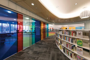
Color transitions help move guests around the first floor. “The entrance area has muted colors, more metallic, gray and silver,” says Nash. “Pops of color then draw you to different areas on the first floor.” For example, colored glass panels signal arrival in the “middle school” area. Light and shape interact in this space, as 3form LED fixtures match the configuration of the seating below. Downlights from Delray provide bursts of light and illuminate the ceiling plane.
Tying the youth area together is a replica of a childhood favorite: a curved overhead indirect/direct LED system from Visa that the architects dubbed “the racetrack.” Resembling an electric toy racetrack, the system measures almost 1,000 ft and was essentially snapped together as a kids’ set would be. The pattern of the light resembles a highway’s broken white line, as it casts 90 fc on the ceiling to maximize brightness in this space.
MARKETING FROM AFAR
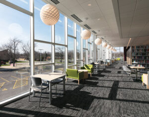
One of the design team’s objectives was to “market” the library from the exterior. “Library as billboard,” Pohrte calls it, as passersby can see directly into the two-story rectangularshaped structure. The lure to patrons is large, 2-ft long, globe-like decorative LED pendants (Louis Poulsen) that line the second floor along the window. “We wanted you to see the pendants from the outside and be able to ‘place’ yourself [in that area of the library] once inside.” Here, the architecture takes a more linear and traditional approach with long rows of bookshelves, quiet areas and study spaces.
Visitors, of course, can figure that out on their own. No signs necessary.
